Tuesday, 21 February 2023

World Thinking Day


World Thinking Day: The Power of Thinking

Today, on World Thinking Day, we celebrate the power of thinking and its ability to shape the world around us. Thinking is a fundamental aspect of human existence, and our thoughts are the building blocks of our experiences and actions.

At its core, thinking is the process of using our minds to process information and form ideas. We engage in thinking every day, whether we're making decisions, solving problems, or simply reflecting on our experiences. While it may seem like a simple and natural activity, the way we think can have a profound impact on our lives and the world around us.

One of the most powerful aspects of thinking is its ability to shape our beliefs and attitudes. The thoughts we hold about ourselves, others, and the world can influence our behavior, relationships, and overall sense of well-being. For example, if we consistently think negative thoughts about ourselves, we may struggle with self-doubt, low self-esteem, and other psychological challenges. On the other hand, if we cultivate positive and optimistic thoughts, we may feel more confident, resilient, and empowered.

Thinking also plays a critical role in problem-solving and decision-making. By engaging in critical thinking, we can analyze complex situations, weigh different options, and make informed choices. Whether we're facing a personal challenge or a global crisis, our ability to think critically can help us navigate the uncertainties and complexities of the world around us.

Finally, thinking can be a powerful tool for personal growth and self-discovery. By reflecting on our experiences and examining our thoughts and beliefs, we can gain a deeper understanding of ourselves and the world around us. This process of self-reflection can help us identify our strengths and weaknesses, clarify our values and goals, and develop a greater sense of purpose and meaning in our lives.

To all the coders out there, as you work on your projects and tackle complex problems, remember that thinking is the foundation of all great coding. Your ability to think critically, creatively, and strategically is what sets you apart as a coder.

In the process of coding, you need to think about the design of your code, the algorithms you use, and the structure of your program. You need to be able to analyze problems, break them down into smaller pieces, and then find solutions that work. This requires a combination of logic, creativity, and attention to detail.

But thinking is not just about problem-solving - it's also about being able to see the big picture. As a coder, you need to be able to anticipate potential roadblocks, imagine new possibilities, and understand how your code fits into a larger system.

Moreover, thinking is not just a technical skill, but also an essential life skill. The ability to think critically, creatively, and strategically can benefit you in all areas of your life, from personal relationships to career development.

So as you continue to hone your coding skills, remember that your ability to think is your greatest asset. Keep expanding your mind, asking questions, and exploring new ideas. With a strong foundation in thinking, you can unlock your full potential as a coder and as a person.

On this World Thinking Day, let us celebrate the power of thinking and the ways in which it can shape our lives and the world around us. By cultivating a more intentional, thoughtful, and reflective approach to our thinking, we can unlock our full potential as individuals and as a global community.


Amelioration

This article was researched and written with the help of ChatGPT, a language model developed by OpenAI.

Special thanks to ChatGPT for providing valuable information and examples used in this article.


Monday, 20 February 2023

Creating interactive plots such as bar, scatter, line, and pie charts using plotly

Plotly is a powerful data visualization library that allows you to create interactive plots and charts. It supports a variety of chart types, including bar, scatter, line, and pie charts. In this tutorial, we will learn how to use Plotly to create interactive plots in Python.

Installation

To use Plotly, you need to install it first. You can install Plotly using pip:

pip install plotly

Creating Interactive Bar Charts

Bar charts are used to compare categorical data. They are created by specifying the categories on the x-axis and the values on the y-axis. Let's create an interactive bar chart using Plotly.

First, we need to import the required libraries and generate some random data:

 
import plotly.graph_objs as go
import numpy as np
np.random.seed(42)
x = ['A', 'B', 'C', 'D', 'E']
y = np.random.randint(0, 100, size=len(x))

Next, we will create a Bar object and specify the x and y values. We will also define a layout for the chart and create a Figure object that combines the data and layout:

 
data = [go.Bar(x=x, y=y)]
layout = go.Layout(title='Interactive Bar Chart', xaxis=dict(title='Category'), yaxis=dict(title='Value'))
fig = go.Figure(data=data, layout=layout)

Finally, we will display the chart using the show method:

 
fig.show()


This will display the interactive bar chart in your web browser.

Creating Interactive Scatter Plots

Scatter plots are used to visualize the relationship between two numerical variables. They are created by specifying the x and y values. Let's create an interactive scatter plot using Plotly.

First, we need to generate some random data:

 
np.random.seed(42)
x = np.random.randint(0, 100, size=50)
y = np.random.randint(0, 100, size=50)

Next, we will create a Scatter object and specify the x and y values. We will also define a layout for the chart and create a Figure object that combines the data and layout:

 
data = [go.Scatter(x=x, y=y, mode='markers')]
layout = go.Layout(title='Interactive Scatter Plot', xaxis=dict(title='X'), yaxis=dict(title='Y'))
fig = go.Figure(data=data, layout=layout)

Finally, we will display the chart using the show method:

 
fig.show()


This will display the interactive scatter plot in your web browser.

Creating Interactive Line Charts

Line charts are used to visualize the trend of a numerical variable over time. They are created by specifying the x and y values. Let's create an interactive line chart using Plotly.

First, we need to generate some random data:

 
np.random.seed(42)
x = np.arange(0, 10, 0.1)
y = np.sin(x)

Next, we will create a Scatter object and specify the x and y values. We will also define a layout for the chart and create a Figure object that combines the data and layout:

 
data = [go.Scatter(x=x, y=y)]
layout = go.Layout(title='Interactive Line Chart', xaxis=dict(title='X'), yaxis=dict(title='Y'))
fig = go.Figure(data=data, layout=layout)

Finally, we will display the chart using the show method:

 
fig.show()


This will display the interactive line chart

in your web browser.

Creating Interactive Pie Charts

Pie charts are used to show the proportion of different categories in a dataset. They are created by specifying the categories and their values. Let's create an interactive pie chart using Plotly.

First, we need to generate some random data:

 
np.random.seed(42)
labels = ['A', 'B', 'C', 'D', 'E']
values = np.random.randint(0, 100, size=len(labels))

Next, we will create a Pie object and specify the labels and values. We will also define a layout for the chart and create a Figure object that combines the data and layout:

 
data = [go.Pie(labels=labels, values=values)]
layout = go.Layout(title='Interactive Pie Chart')
fig = go.Figure(data=data, layout=layout)

Finally, we will display the chart using the show method:

 
fig.show()


This will display the interactive pie chart in your web browser.

Customizing Interactive Plots

Plotly provides a wide range of customization options for interactive plots. For example, you can change the color, font, and size of the chart elements. You can also add annotations, titles, and legends to the chart. Here is an example of customizing a bar chart:

 
data = [go.Bar(x=x, y=y, marker=dict(color='blue'))]
layout = go.Layout(title='Interactive Bar Chart', xaxis=dict(title='Category'), yaxis=dict(title='Value'),
                   font=dict(family='Arial', size=16), annotations=[dict(x='B', y=50, text='Annotation')])
fig = go.Figure(data=data, layout=layout)
fig.show()


This will display the interactive bar chart with customizations in your web browser.


Amelioration

This article was researched and written with the help of ChatGPT, a language model developed by OpenAI.

Special thanks to ChatGPT for providing valuable information and examples used in this article.


Sunday, 19 February 2023

Introduction to Plotly and its interactive capabilities

    Introduction to Plotly and its Interactive Capabilities

Plotly is a data visualization library that enables the creation of interactive, publication-quality graphs and figures. It is open source, has APIs for many programming languages such as Python, R, and JavaScript, and allows users to create a wide range of charts, including scatter plots, line charts, bar charts, heatmaps, and more.

    In this tutorial, we will be focusing on Plotly's interactive capabilities, which allow users to create plots that can be explored and manipulated by end-users. We will be using Python and the Plotly Python library, which is a popular choice for data scientists and data analysts.

    To follow along with this tutorial, you will need to have the Plotly Python library installed. You can install it using pip by running the following command:

pip install plotly

    Once you have installed the library, you can begin creating interactive plots with Plotly.

    Creating a Basic Interactive Plot

    Let's start by creating a basic interactive plot. In this example, we will be creating a scatter plot that shows the relationship between the number of hours a student studies and the grade they receive on a test.

    Here's the code to create this plot:

import plotly.express as px

import pandas as pd

# Create a sample dataset

df = pd.DataFrame({

    "Hours Studied": [1, 2, 3, 4, 5, 6, 7, 8, 9, 10],

    "Test Grade": [52, 60, 69, 73, 81, 87, 92, 95, 97, 99]

})

# Create the interactive scatter plot

fig = px.scatter(df, x="Hours Studied", y="Test Grade", title="Test Grades vs. Hours Studied")

fig.show()


This code imports the necessary libraries, creates a sample dataset with two columns ("Hours Studied" and "Test Grade"), and creates an interactive scatter plot using the px.scatter() function. The fig.show() function is used to display the plot.

    When you run this code, you should see an interactive scatter plot that displays the relationship between hours studied and test grade. You can hover over the points to see the exact values, and you can use the zoom and pan controls to explore the plot in more detail.

    Adding Interactivity to Plots

    One of the main benefits of using Plotly is the ability to add interactivity to your plots. This can include things like hover text, tooltips, clickable legends, and more.

    Let's modify our previous example to add some interactivity to the plot. Specifically, we will add hover text to the scatter plot that displays the number of hours studied and the test grade for each point.

Here's the updated code:

import plotly.express as px
import pandas as pd
# Create a sample dataset
df = pd.DataFrame({
    "Hours Studied": [1, 2, 3, 4, 5, 6, 7, 8, 9, 10],
    "Test Grade": [52, 60, 69, 73, 81, 87, 92, 95, 97, 99]
})
# Create the interactive scatter plot with hover text
fig = px.scatter(df, x="Hours Studied", y="Test Grade", title="Test Grades vs. Hours Studied", hover_data=["Hours Studied", "Test Grade"])
fig.show()


 In this updated code, we added the hover_data parameter to the px.scatter() function, which specifies which data should be displayed in the hover text for each point. In this case, we want to display both the "Hours Studied" and "Test Grade" columns.

    When you run this code, you should see an interactive scatter plot with hover text that displays the number of hours studied and the test grade for each point. You can hover over the points to see the hover text, and you can use the zoom and pan controls to explore the plot in more detail.

    Customizing Interactive Plots

    Plotly also allows users to customize their interactive plots in a wide variety of ways. This can include things like changing the color scheme, adding annotations, changing the axis labels, and more.

    Let's modify our previous example to customize the plot's appearance. Specifically, we will change the color scheme of the plot, add a trendline to show the relationship between hours studied and test grade, and add annotations to highlight the highest and lowest test grades.

    Here's the updated code:

 
import plotly.express as px
import pandas as pd
 
# Create a sample dataset
df = pd.DataFrame({
    "Hours Studied": [1, 2, 3, 4, 5, 6, 7, 8, 9, 10],
    "Test Grade": [52, 60, 69, 73, 81, 87, 92, 95, 97, 99]
})
 
# Create the interactive scatter plot with customizations
fig = px.scatter(df, x="Hours Studied", y="Test Grade", title="Test Grades vs. Hours Studied",
                 trendline="ols", color_discrete_sequence=["purple"], hover_data=["Hours Studied", "Test Grade"])
 
# Add annotations for highest and lowest test grades
fig.add_annotation(x=10, y=99, text="Highest Test Grade", showarrow=True, arrowhead=1)
fig.add_annotation(x=1, y=52, text="Lowest Test Grade", showarrow=True, arrowhead=1)
 
# Change the axis labels
fig.update_layout(xaxis_title="Hours Studied", yaxis_title="Test Grade")
 
fig.show()


    In this updated code, we added several customizations to the plot. We used the trendline parameter to add a trendline that shows the relationship between hours studied and test grade. We also used the color_discrete_sequence parameter to change the color scheme of the plot to purple.

    We then added two annotations to highlight the highest and lowest test grades. Finally, we used the update_layout() function to change the axis labels to "Hours Studied" and "Test Grade".

    When you run this code, you should see an interactive scatter plot with customizations that includes a trendline, annotations, and changed axis labels.

Conclusion

    In this tutorial, we provided an introduction to Plotly and its interactive capabilities. We demonstrated how to create a basic interactive plot, how to add interactivity to plots, and how to customize plots to suit your needs.

Plotly is a powerful tool for creating interactive visualizations and can be used to create a wide range of charts and figures. By using Plotly's interactive capabilities, you can create visualizations that are engaging, informative, and fun to explore.


Amelioration

This article was researched and written with the help of ChatGPT, a language model developed by OpenAI.

Special thanks to ChatGPT for providing valuable information and examples used in this article.


Saturday, 18 February 2023

Color palettes and color coding in seaborn


Data visualization is a crucial aspect of data analysis, as it helps convey complex information in an e

asy-to-understand manner. Seaborn is a popular Python data visualization library that is built on top of Matplotlib. It provides a high-level interface for creating informative and aesthetically pleasing statistical graphics.

One of the key features of Seaborn is its ability to customize the color palettes and color codes used in the plots. In this article, we will explore how color palettes and color coding can be used in Seaborn to create stunning visualizations.

Color Palettes in Seaborn

A color palette is a set of colors that are used in a plot to represent different categories or groups. Seaborn provides several built-in color palettes that can be used to represent categorical data. These palettes are chosen to be visually distinct from each other, making it easy to differentiate between categories.

The default color palette in Seaborn is the "deep" palette, which provides a set of distinct colors that can be used to represent up to eight categories. To use the "deep" palette, you can simply call the "sns.color_palette()" function with no arguments:

 
import seaborn as sns
sns.color_palette()


This will return a list of RGB tuples, which can be used to set the colors in your plot. For example, you can use these colors to create a bar plot with distinct colors for each category:

 
import seaborn as sns
import matplotlib.pyplot as plt
tips = sns.load_dataset("tips")
sns.set_style("whitegrid")
sns.barplot(x="day", y="total_bill", hue="sex", data=tips, palette="deep")
plt.show()


In this example, we are using the "deep" palette to set the colors for the "sex" category in the bar plot. Seaborn automatically uses a different color for each category, making it easy to differentiate between them.

Seaborn provides several other built-in color palettes that can be used to represent different numbers of categories. For example, the "pastel" palette provides a set of colors that are suitable for up to six categories, while the "bright" palette provides a set of colors that are suitable for up to ten categories.

Customizing Color Palettes

In addition to the built-in color palettes, Seaborn also allows you to create your own custom color palettes. This can be useful when you want to use colors that are specific to your data or to match the colors used in your company's branding.

To create a custom color palette, you can use the "sns.color_palette()" function with a list of colors. For example, the following code creates a custom color palette with three colors:

 
import seaborn as sns
my_palette = sns.color_palette(["#FFC300", "#FF5733", "#C70039"])


In this example, we are creating a custom color palette with three colors: yellow (#FFC300), orange (#FF5733), and red (#C70039). We can then use this custom color palette in our plots by passing it as an argument to the "palette" parameter.

 
import seaborn as sns
import matplotlib.pyplot as plt
tips = sns.load_dataset("tips")
my_palette = sns.color_palette(["#FFC300", "#FF5733", "#C70039"])
sns.set_palette(my_palette)
sns.set_style("whitegrid")
sns.barplot(x="day", y="total_bill", hue="sex", data=tips)
plt.show()


In this example, we are setting the custom color palette we created as the default color palette for Seaborn by calling the "sns.set_palette()" function. We can then create a bar plot

using the "barplot()" function as before, and Seaborn will automatically use the colors from our custom color palette to represent the different categories.

Color Coding in Seaborn

In addition to color palettes, Seaborn also provides color coding functionality that can be used to map numeric variables to colors in a plot. This can be useful when you want to represent additional information in your plot, such as the size or value of a variable.

To use color coding in Seaborn, we can use the "hue" parameter in our plot functions. The "hue" parameter allows us to map a variable to the colors used in the plot. For example, in the following code, we are using the "hue" parameter to map the "size" variable to the colors used in the scatter plot:

 
import seaborn as sns
import matplotlib.pyplot as plt
tips = sns.load_dataset("tips")
sns.set_style("whitegrid")
sns.scatterplot(x="total_bill", y="tip", hue="size", data=tips)
plt.show()


In this example, Seaborn automatically assigns a different color to each value of the "size" variable, making it easy to see the relationship between the size of the group and the total bill and tip.

Conclusion

Color palettes and color coding are important tools for creating informative and visually appealing data visualizations. Seaborn provides a wide range of built-in color palettes, as well as the ability to create custom color palettes, to help you represent categorical data in your plots. In addition, Seaborn's color coding functionality allows you to map numeric variables to colors in your plots, helping you represent additional information in your visualizations. By leveraging these tools, you can create stunning and informative data visualizations that effectively communicate your data insights.


Amelioration

This article was researched and written with the help of ChatGPT, a language model developed by OpenAI.

Special thanks to ChatGPT for providing valuable information and examples used in this article.


Friday, 17 February 2023

Python Seaborn Regression Visualization.

Seaborn is a popular data visualization library for Python. It provides a simple and easy-to-use interface for creating beautiful and informative plots. One of the key features of Seaborn is its ability to create visualizations for regression models. In this tutorial, we will walk through how to use Seaborn to visualize regression models.

Step 1: Importing the necessary libraries

First, we need to import the libraries that we will be using in this tutorial. In addition to Seaborn, we will also be using NumPy and Pandas to generate our data.

 
import seaborn as sns
import numpy as np
import pandas as pd

Step 2: Generating the Data

In order to visualize regression models, we need to generate some data to work with. We can use NumPy and Pandas to create a dataset with two variables, x and y, that are related in some way. In this example, we will use a linear relationship between x and y.

 
np.random.seed(0)
x = np.random.rand(100)
y = x + np.random.rand(100) * 0.1
df = pd.DataFrame({'x': x, 'y': y})

Here, we are generating 100 random values for x and adding some random noise to generate y.


Step 3: Creating a Scatter Plot

Before we create a regression model, let's first create a scatter plot of the data to see what it looks like. We can use Seaborn's scatterplot() function to create a scatter plot.

 
sns.scatterplot(x='x', y='y', data=df)


This will create a scatter plot of x versus y.

Step 4: Creating a Regression Plot

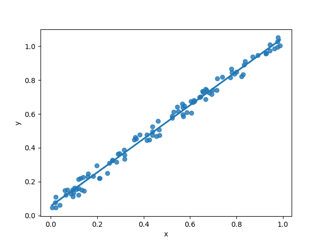
Now that we have a scatter plot of our data, let's create a regression plot to visualize the relationship between x and y. We can use Seaborn's regplot() function to create a regression plot.

 
sns.regplot(x='x', y='y', data=df)


This will create a regression plot of x versus y.

Step 5: Customizing the Regression Plot

We can customize the regression plot to make it more informative and aesthetically pleasing. Here are a few examples of customizations that we can make:

Changing the color and marker of the data points

 
sns.regplot(x='x', y='y', data=df, color='purple', marker='o')


This will create a regression plot of x versus y with purple data points and circular markers.

Adding a line for the regression model

 
sns.regplot(x='x', y='y', data=df,
 color='purple', marker='o', 
 line_kws={'color': 'red'})


    This will create a regression plot of x versus y with a red line for the regression model.

Changing the size and shape of the markers

 
sns.regplot(x='x', y='y', data=df, 
    color='purple', marker='o', 
    scatter_kws={'s': 100, 'alpha': 0.5,
     'edgecolor': 'black'})


This will create a regression plot of x versus y with larger and more transparent purple data points with black edges.


Amelioration

This article was researched and written with the help of ChatGPT, a language model developed by OpenAI.

Special thanks to ChatGPT for providing valuable information and examples used in this article.